The Ultimate Flutter Layout Guide
The only guide you need to layout your Flutter widgets hassle-free.

I am a full stack developer, a Machine Learning enthusiast & a Flutter Developer. Also, I am a budding Entrepreneur!
I am a student of Life and believe in building tech for people.
I love contributing to open-source projects and use my knowledge to develop a software solution for general problems arising in the community.
Have you ever been stuck on any of these errors while building a Flutter app?
> A RenderFlex overflowed…
> RenderBox was not laid out
> Viewport was given unbounded height
> An InputDecorator…cannot have an unbounded width
> Incorrect use of ParentData widget
If yes, then this blog post is for you!
In this blog post, I'll discuss and share some common Flutter layout scenarios and best practices. I'll try to focus more on code snippets and less on widget details. For widget details, I'll share the relevant link for the same.
Contents
- Prerequisites
- Single-child layout widgets
- Multi-child layout widgets
- References
Prerequisites
- Basic knowledge of Flutter widgets
- Desire to learn something new
Single-child layout widgets
Align
A widget that aligns its child within itself and optionally sizes itself based on the child's size.
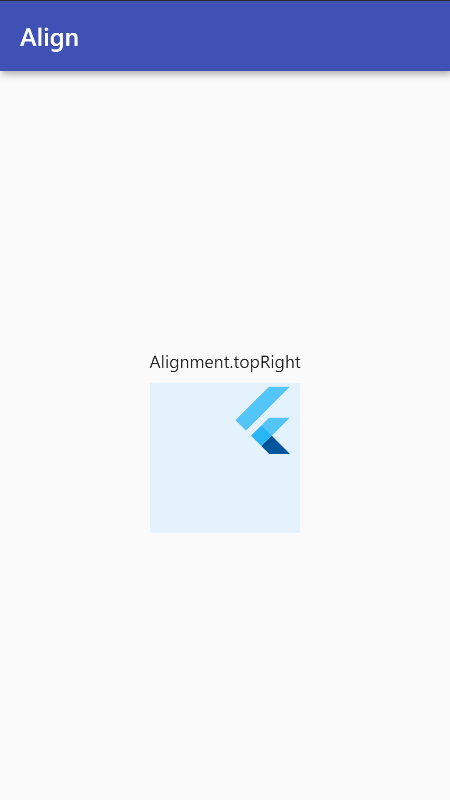
Center(
  child: Container(
    height: 120.0,
    width: 120.0,
    color: Colors.blue[50],
    child: const Align(
      alignment: Alignment.topRight,
      child: FlutterLogo(
        size: 60,
      ),
    ),
  ),
)
If you want to align your widget by a ratio from the parent's centre:
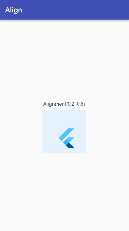
Center(
  child: Container(
    height: 120.0,
    width: 120.0,
    color: Colors.blue[50],
    child: const Align(
      alignment: Alignment(0.2, 0.6),
      child: FlutterLogo(
        size: 60,
      ),
    ),
  ),
)
Read more about Align here.
AspectRatio
A widget that attempts to size the child to a specific aspect ratio.
Note: aspectRatio = width / height
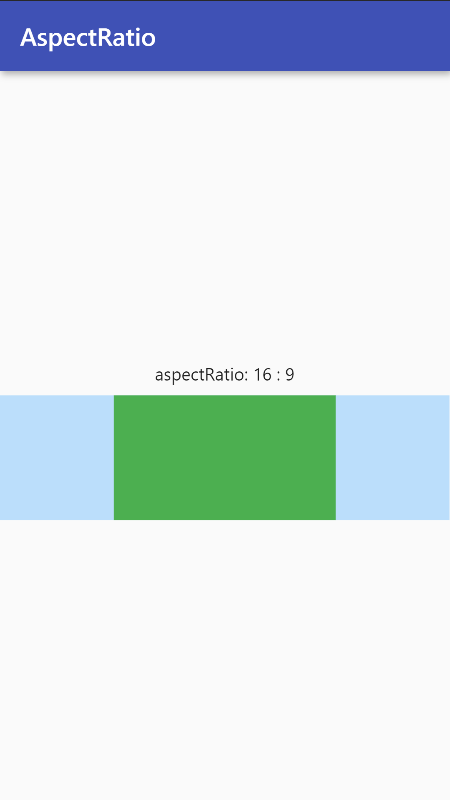
Container(
  color: Colors.blue[100],
  alignment: Alignment.center,
  width: double.infinity,
  height: 100.0,
  child: AspectRatio(
    aspectRatio: 16 / 9,
      child: Container(
        color: Colors.green,
    ),
  ),
)
Best Practices:
- Never put
AspectRatio()insideExpanded()or similar widgets that force their child/children to stretch or take up the whole space given by the parent. - If needed, put the
AspectRatio()widget insideAlign()insideExpanded().
Example:
Expanded(
  child: Align(
    AspectRatio(
      aspectRatio: 16 / 9,
        child: Container(),
    ),
  ),
)
Read more about AspectRatio here.
Center
A widget that centers its child within itself. By default, the widget will match its child's size.
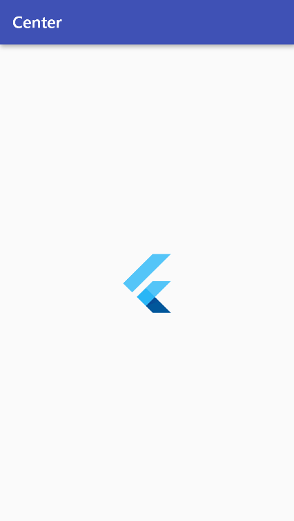
Center(
  child: FlutterLogo(
    size: 60,
  ),
)
Read more about Center here.
ConstrainedBox
By default, most of the widgets will use as little space as possible.
For Examlpe:
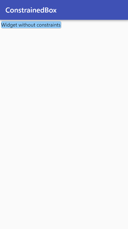
Card(
  color: Colors.blue[200],
  child: Text(
    'Widget without constraints',
  ),
)
ConstrainedBox allows its child widget to use the remaining space as desired.
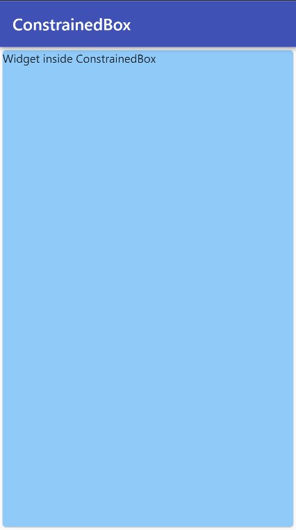
ConstrainedBox(
  constraints: BoxConstraints.expand(),
  child: Card(
    color: Colors.blue[200],
    child: Text(
      'Widget inside ConstrainedBox',
    ),
  ),
)
Note: The same behavior can be obtained using the SizedBox.expand() widget.
Read more about ConstrainedBox here.
Container
Container is one of the most frequently used Widgets!
Container combines a number of other widgets each with their own layout behavior, thus Container's layout behavior is somewhat complicated.
Before we move forward, it's important to understand the layout behavior of the Container.
Layout Behavior
- If the Container has no
child, noheight, nowidth, no constraints, and the parent provides unbounded constraints, then Container tries to size as small as possible. - If the Container has no
childand noalignment, but aheight,width, or constraints are provided, then the Container tries to be as small as possible given the combination of those constraints and the parent's constraints. - If the Container has no
child, noheight, nowidth, no constraints, and noalignment, but the parent provides bounded constraints, then Container expands to fit the constraints provided by the parent. - If the Container has an
alignment, and the parent provides unbounded constraints, then the Container tries to size itself to match thechild. - If the Container has an
alignment, and the parent provides bounded constraints, then the Container tries to expand to fit the parent and then positions thechildwithin itself as per the alignment. - Otherwise, if the Container has a
childbut noheight, nowidth, no constraints, and noalignment, the Container passes the constraints from the parent to thechildand sizes itself to match the child.
I know that was quite much! But don't worry, you'll get it soon. Let's have a look at some samples below:
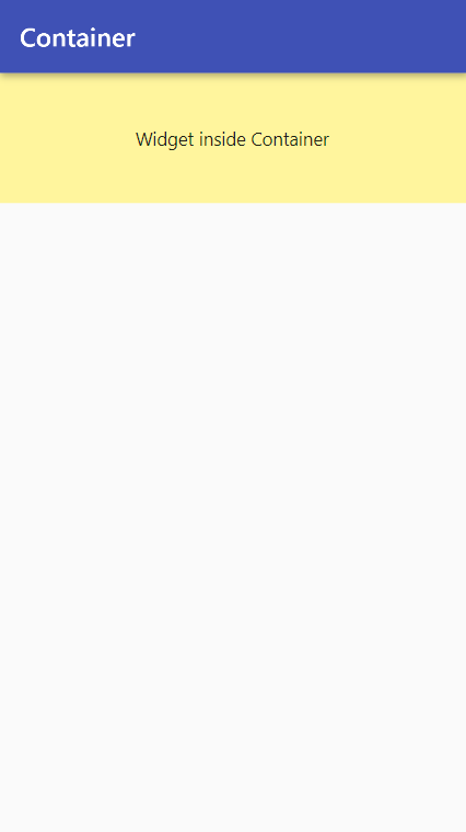
- When you don’t specify the
heightand thewidthof the Container, it will match itschild’s size.
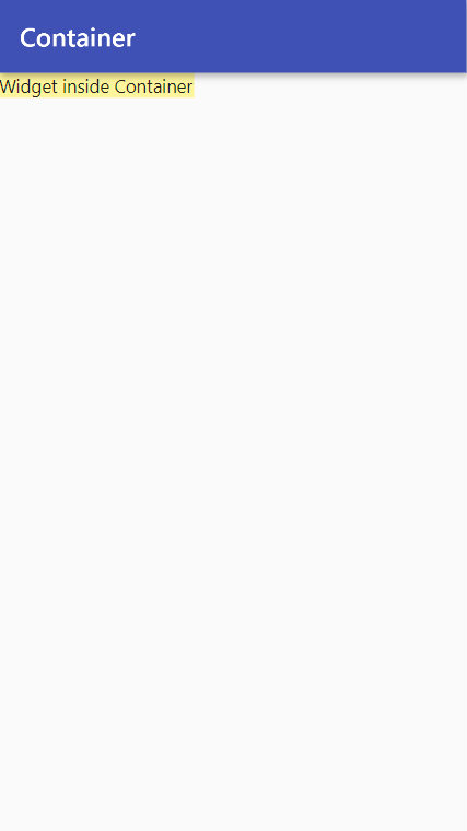
Widget build(BuildContext context) {
  return Scaffold(
    appBar: AppBar(
      title: Text(widget.title),
    ),
    body: Container(
      color: Colors.yellow[200],
      child: Text(
        'Widget inside Container',
      ),
    ),
  );
}
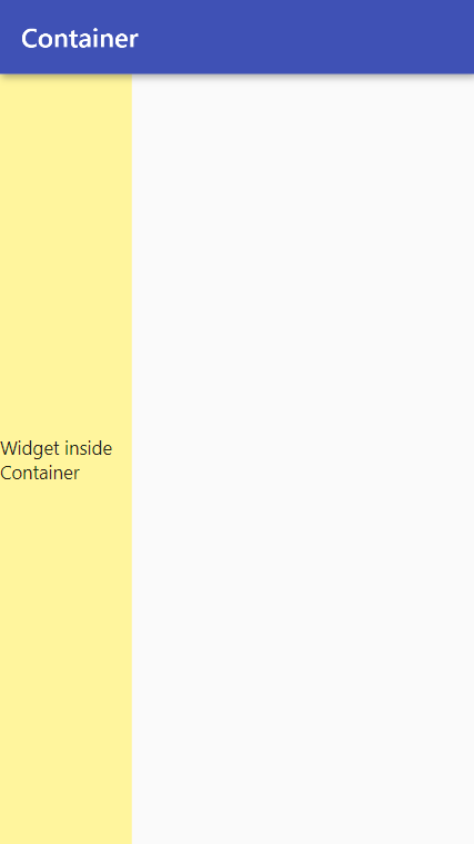
- When you don’t specify the
heightand thewidthof the Container, but specify thealignment, it will match its parent’s size and align itschildaccording to the specifiedalignmentproperty.
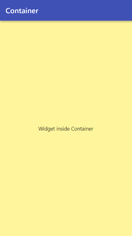
Widget build(BuildContext context) {
  return Scaffold(
    appBar: AppBar(
      title: Text(widget.title),
    ),
    body: Container(
      color: Colors.yellow[200],
      alignment: Alignment.center,
      child: Text(
        'Widget inside Container',
      ),
    ),
  );
}
- When you only specify the
heightof the Container, it will match itschild’swidth.
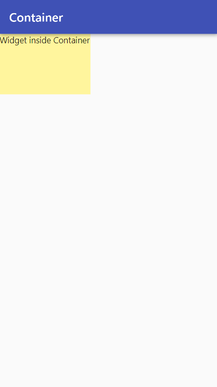
Widget build(BuildContext context) {
  return Scaffold(
    appBar: AppBar(
      title: Text(widget.title),
    ),
    body: Container(
      color: Colors.yellow[200],
      height: 100,
      child: Text(
        'Widget inside Container',
      ),
    ),
  );
}
- When you only specify the
widthof the Container, it will match itschild’sheight.
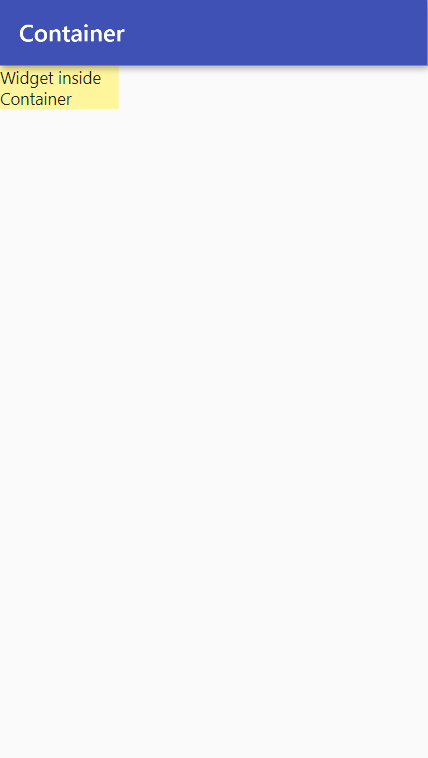
Widget build(BuildContext context) {
  return Scaffold(
    appBar: AppBar(
      title: Text(widget.title),
    ),
    body: Container(
      color: Colors.yellow[200],
      width: 100,
      child: Text(
        'Widget inside Container',
      ),
    ),
  );
}
- When you only specify the
heightof the Container but also specify thealignment, it will match its parent’swidthand align itschildaccording to the specifiedalignmentproperty.
Widget build(BuildContext context) {
  return Scaffold(
    appBar: AppBar(
      title: Text(widget.title),
    ),
    body: Container(
      color: Colors.yellow[200],
      height: 100,
      alignment: Alignment.center,
      child: Text(
        'Widget inside Container',
      ),
    ),
  );
}
- When you only specify the
widthof the Container but also specify thealignment, it will match its parent’sheightand align itschildaccording to the specifiedalignmentproperty.
Widget build(BuildContext context) {
  return Scaffold(
    appBar: AppBar(
      title: Text(widget.title),
    ),
    body: Container(
      color: Colors.yellow[200],
      width: 100,
      alignment: Alignment.center,
      child: Text(
        'Widget inside Container',
      ),
    ),
  );
}
Read more about Container here.
Expanded
A widget that expands a child of a Row, Column, or Flex so that the child fills the available space. It's great for distributing space between multiple items.
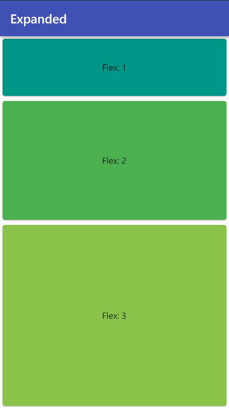
Column /*or Row*/ (
  children: <Widget>[
    Expanded(
      child: Card(
        color: Colors.teal,
        child: Center(child: Text('Flex: 1')),
      ),
      flex: 1,
    ),
    Expanded(
      child: Card(
        color: Colors.green,
        child: Center(child: Text('Flex: 2')),
      ),
      flex: 2,
    ),
    Expanded(
      child: Card(
        color: Colors.lightGreen,
        child: Center(child: Text('Flex: 3')),
      ),
      flex: 3,
    ),
  ],
),
Read more about Expanded here.
FittedBox
Scales and positions its child within itself according to fit. It's mainly used to fit images inside itself just like how you fit wallpapers on your desktop!
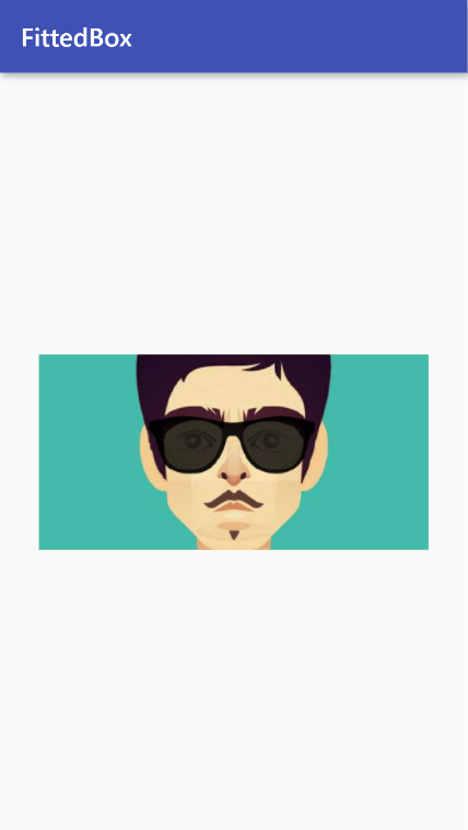
Container(
  height: 150,
  width: 300,
  color: Colors.yellow[200],
  child: FittedBox(
    clipBehavior: Clip.antiAlias,
    fit: BoxFit.cover,
    child: Image.network(
      'https://xyz.jpg',
    ),
  ),
),
Read more about FittedBox here.
FractionallySizedBox
A widget that sizes its child to a fraction of the total available space.
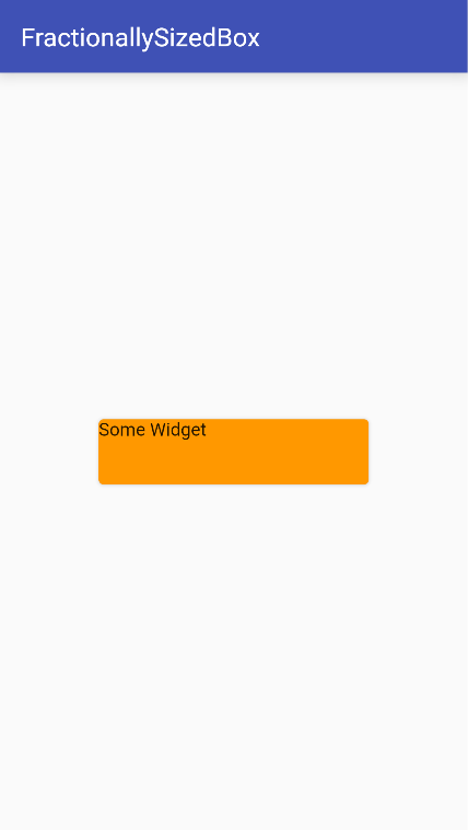
Center(
  child: FractionallySizedBox(
    widthFactor: 0.6,
    heightFactor: 0.1,
    child: Card(
      color: Colors.orange,
      child: Text('Some Widget'),
    ),
  ),
),
Best Practices:
- Use
FractionallySizedBox()with nochildfor fractional sized white space. - Wrap
FractionallySizedBox()insideFlexible()widget so it plays well withRow/Column.
Read more about FractionallySizedBox here.
SizedBox
It is one of the simplest yet useful Widgets. It enforces a specific size on its child.
Layout Behavior
- If given a
child, this widget forces it to have a specificwidthand/orheight. - These values will be ignored if this widget's parent does not permit them. For example, this happens if the parent is the screen or another SizedBox.
- If either the
widthorheightis null, SizedBox will try to size itself to match thechild's size in that dimension. - If
heightorwidthis null or unspecified, it will be treated as zero. - Use
SizedBox.expand()to make the SizedBox match the size of its parent. It is equivalent to settingwidthandheighttodouble.infinity.
Let's have a look at some samples below:
- SizedBox as fixed-size padding
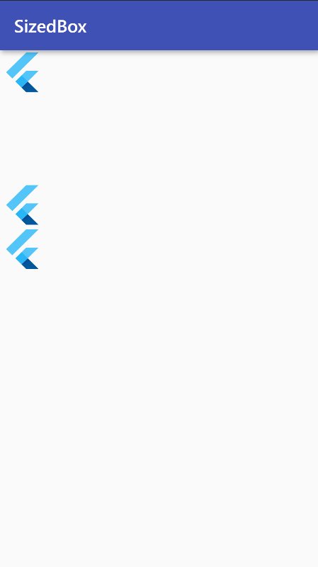
Column(
  children: <Widget>[
    FlutterLogo(size: 50),
    const SizedBox(height: 100),
    FlutterLogo(size: 50),
    FlutterLogo(size: 50),
  ],
),
- If you want to match the size of the parent, use
SizedBox.expand()
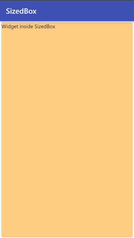
SizedBox.expand(
  child: Card(
    color: Colors.orange[200],
    child: Text('Widget inside SizedBox'),
  ),
),
Best Practices
- When placing SizedBox as a
childinside a parent Widget which forces itschildto be the same size as itself (e.g. another SizedBox), then wrap the child SizedBox in a widget that does permit it to be any size up to the size of the parent, such asCenterorAlign.
Example:
SizedBox(
  height: double.infinity,
  width: double.infinity,
  child: Align(
    child: SizedBox(
      height: 100,
      width: 100,
      child: Card(
        color: Colors.orange[200],
        child: Text('Widget inside SizedBox'),
      ),
    ),
  ),
)
Read more about SizedBox here.
Multi-child layout widgets
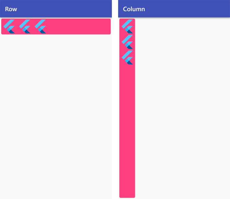
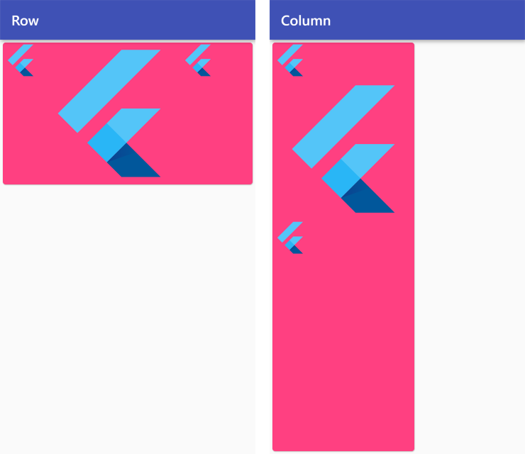
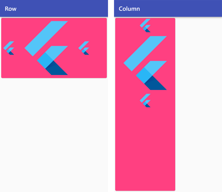
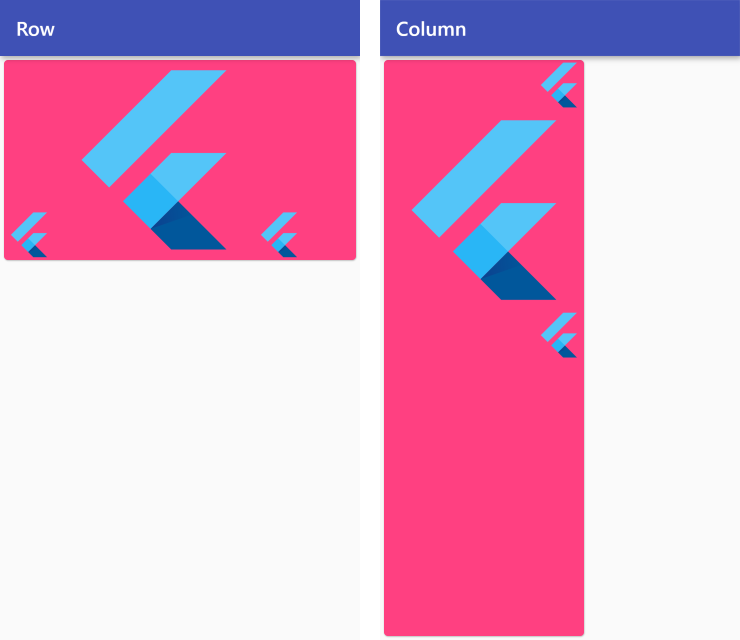
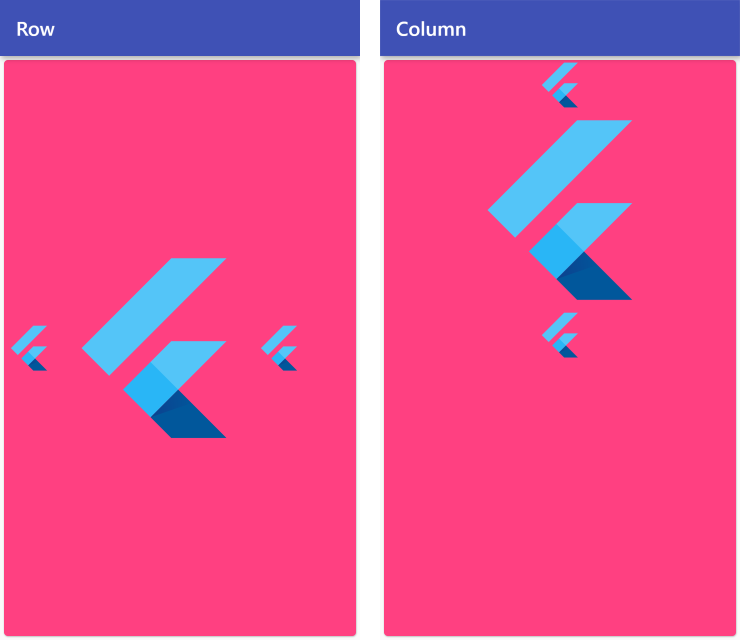
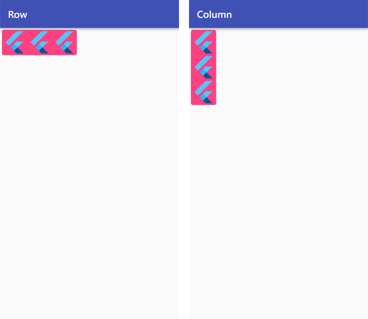
Row and Column
Row: Layout a list of child widgets in the horizontal direction.
Column: Layout a list of child widgets in the vertical direction.
To align the child widgets inside Row/Column, we use mainAxisAlignment and crossAxisAlignment. Let's have a look at both of these parameters:
MainAxisAlignment
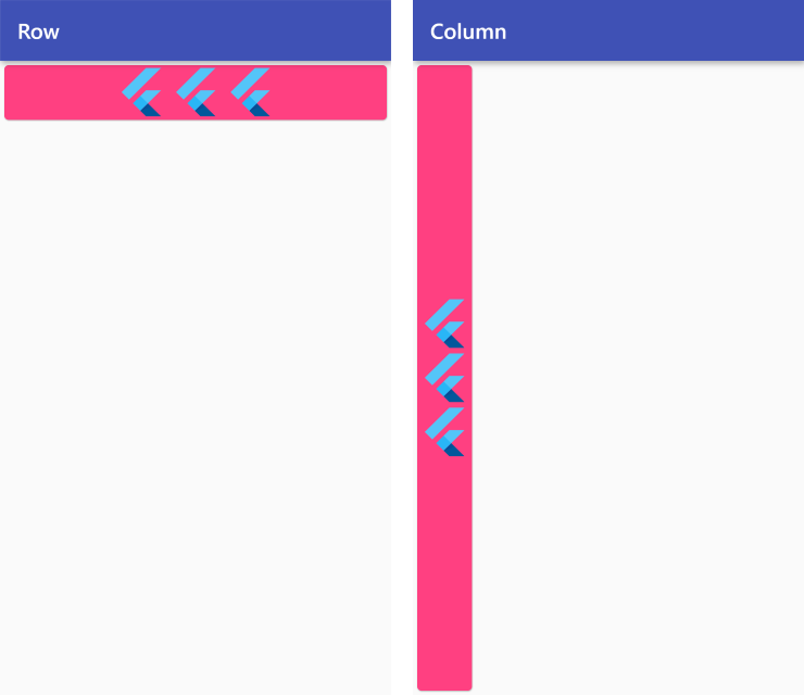
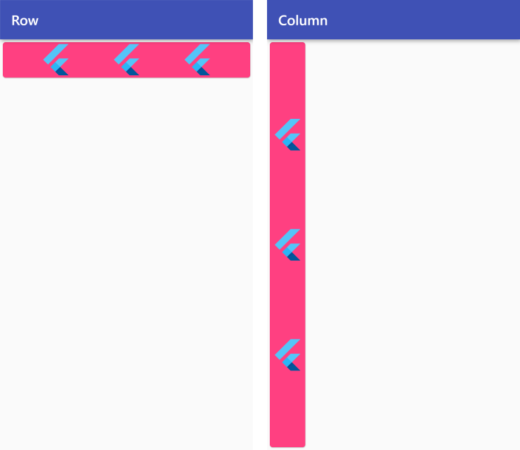
MainAxisAlignment.start
Row /*or Column*/ (
  mainAxisAlignment: MainAxisAlignment.start,
  children: <Widget>[
    FlutterLogo(size: 50),
    FlutterLogo(size: 50),
    FlutterLogo(size: 50),
  ],
),
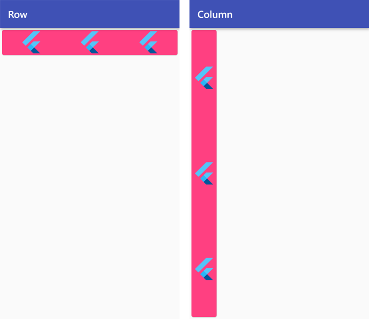
MainAxisAlignment.center
Row /*or Column*/ (
  mainAxisAlignment: MainAxisAlignment.center,
  children: <Widget>[
    FlutterLogo(size: 50),
    FlutterLogo(size: 50),
    FlutterLogo(size: 50),
  ],
),
MainAxisAlignment.end
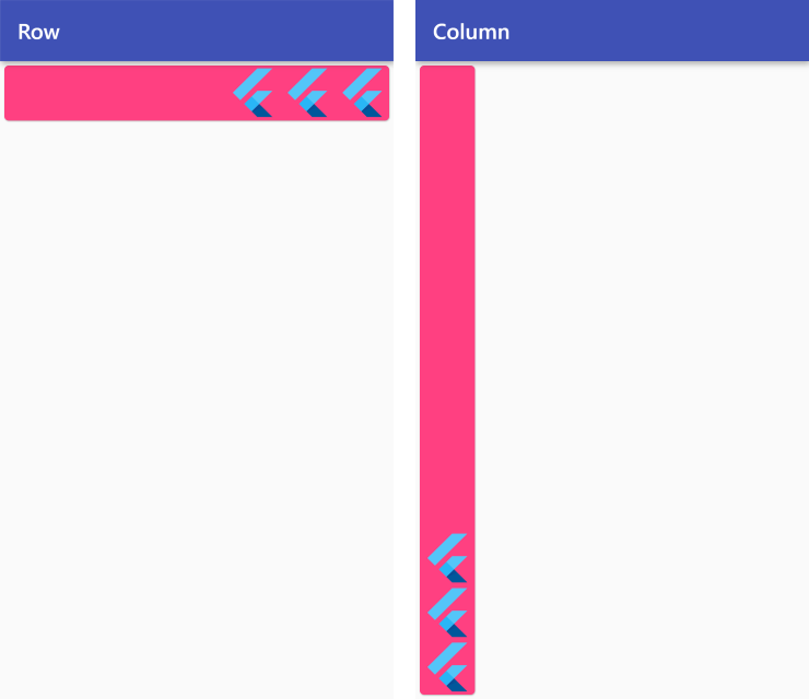
Row /*or Column*/ (
  mainAxisAlignment: MainAxisAlignment.end,
  children: <Widget>[
    FlutterLogo(size: 50),
    FlutterLogo(size: 50),
    FlutterLogo(size: 50),
  ],
),
MainAxisAlignment.spaceBetween

Row /*or Column*/ (
  mainAxisAlignment: MainAxisAlignment.spaceBetween,
  children: <Widget>[
    FlutterLogo(size: 50),
    FlutterLogo(size: 50),
    FlutterLogo(size: 50),
  ],
),
MainAxisAlignment.spaceEvenly
Row /*or Column*/ (
  mainAxisAlignment: MainAxisAlignment.spaceEvenly,
  children: <Widget>[
    FlutterLogo(size: 50),
    FlutterLogo(size: 50),
    FlutterLogo(size: 50),
  ],
),
MainAxisAlignment.spaceAround
Row /*or Column*/ (
  mainAxisAlignment: MainAxisAlignment.spaceAround,
  children: <Widget>[
    FlutterLogo(size: 50),
    FlutterLogo(size: 50),
    FlutterLogo(size: 50),
  ],
),
CrossAxisAlignment
CrossAxisAlignment.start
Row /*or Column*/ (
  crossAxisAlignment: CrossAxisAlignment.start,
  children: <Widget>[
    FlutterLogo(size: 50),
    FlutterLogo(size: 200),
    FlutterLogo(size: 50),
  ],
),
CrossAxisAlignment.center
Row /*or Column*/ (
  crossAxisAlignment: CrossAxisAlignment.center,
  children: <Widget>[
    FlutterLogo(size: 50),
    FlutterLogo(size: 200),
    FlutterLogo(size: 50),
  ],
),
CrossAxisAlignment.end
Row /*or Column*/ (
  crossAxisAlignment: CrossAxisAlignment.end,
  children: <Widget>[
    FlutterLogo(size: 50),
    FlutterLogo(size: 200),
    FlutterLogo(size: 50),
  ],
),
CrossAxisAlignment.stretch
Row /*or Column*/ (
  crossAxisAlignment: CrossAxisAlignment.stretch,
  children: <Widget>[
    FlutterLogo(size: 50),
    FlutterLogo(size: 200),
    FlutterLogo(size: 50),
  ],
),
CrossAxisAlignment.baseline
Places the children along the cross axis such that their baselines match. Since baselines are always horizontal, this alignment is intended forRowWidget. If the main axis is vertical, then this value is treated likeCrossAxisAlignment.start.
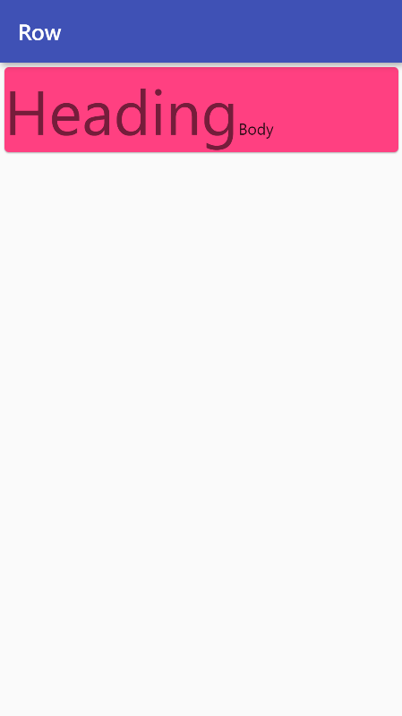
Row(
  crossAxisAlignment: CrossAxisAlignment.baseline,
  textBaseline: TextBaseline.alphabetic,
  children: <Widget>[
    Text(
      'Heading',
      style: Theme.of(context).textTheme.headline2,
    ),
    Text(
      'Body',
      style: Theme.of(context).textTheme.bodyText2,
    ),
  ],
),
Use MainAxisSize to size the Row/Column to either match their parent or fit their children.
MainAxisSize
MainAxisSize.max
Row /*or Column*/ (
  mainAxisSize: MainAxisSize.max,
  children: <Widget>[
    FlutterLogo(size: 50),
    FlutterLogo(size: 50),
    FlutterLogo(size: 50),
  ],
),
MainAxisSize.min
Row /*or Column*/ (
  mainAxisSize: MainAxisSize.min,
  children: <Widget>[
    FlutterLogo(size: 50),
    FlutterLogo(size: 50),
    FlutterLogo(size: 50),
  ],
),
Read more about Row here.
Read more about Column here.
Stack
A widget that positions its children on top of each other.
Let's have a look at some of its interesting properties:
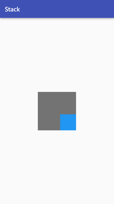
- By default, all the children are aligned to the top-left corner of a Stack.
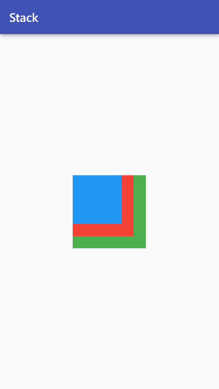
Stack(
  children: <Widget>[
    Container(
      width: 120,
      height: 120,
      color: Colors.green,
    ),
    Container(
      width: 100,
      height: 100,
      color: Colors.red,
    ),
    Container(
      width: 80,
      height: 80,
      color: Colors.blue,
    ),
  ],
),
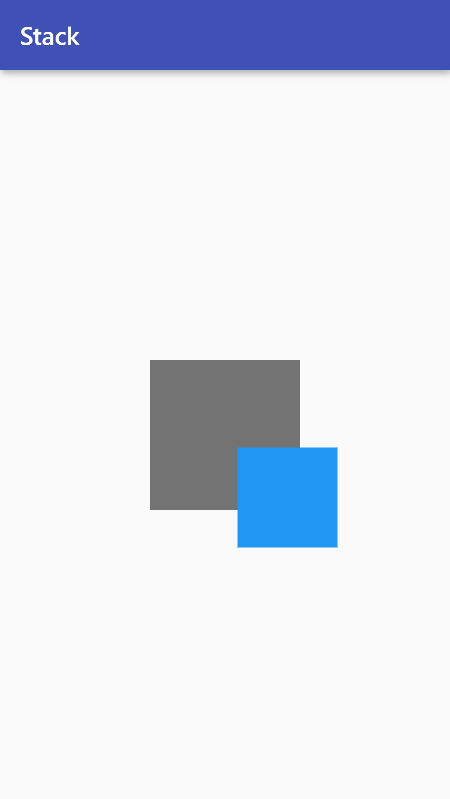
- To align all the children, we can use the
alignmentproperty.
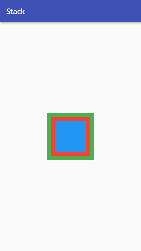
Stack(
  alignment: Alignment.center,
  children: <Widget>[
    Container(
      width: 120,
      height: 120,
      color: Colors.green,
    ),
    Container(
      width: 100,
      height: 100,
      color: Colors.red,
    ),
    Container(
      width: 80,
      height: 80,
      color: Colors.blue,
    ),
  ],
),
- But what if you want to position all the elements uniquely?
In that case, we can either wrap the individual child widgets with an
Align()orPositioned()widget.
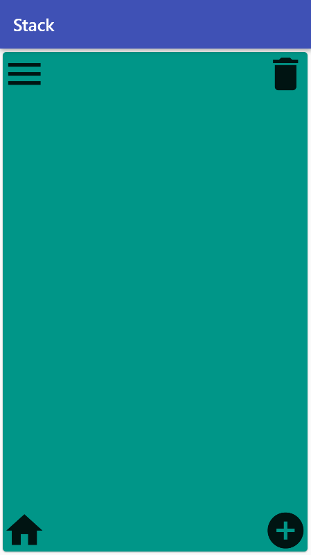
Stack(
  children: <Widget>[
    Align(
      alignment: Alignment.topLeft,
      child: Icon(
        Icons.menu,
      ),
    ),
    Align(
      alignment: Alignment.topRight,
      child: Icon(
        Icons.delete,
      ),
    ),
    Positioned(
      bottom: 0,
      right: 0,
      child: Icon(
        Icons.add_circle,
      ),
    ),
    Positioned(
      bottom: 0,
      left: 0,
      child: Icon(
        Icons.home,
      ),
    ),
  ],
),
- Sometimes, a child moves outside of a Stack's bounds. By default, it will be clipped.
To prevent clipping, use clipBehavior: Clip.none.
Stack(
  alignment: Alignment.center,
  clipBehavior: Clip.none,
  children: <Widget>[
    Container(
      width: 120,
      height: 120,
      color: Colors.black54,
    ),
    Positioned(
      bottom: -30,
      right: -30,
      child: Container(
        width: 80,
        height: 80,
        color: Colors.blue,
      ),
    ),
  ],
),
Read more about Stack here: here.
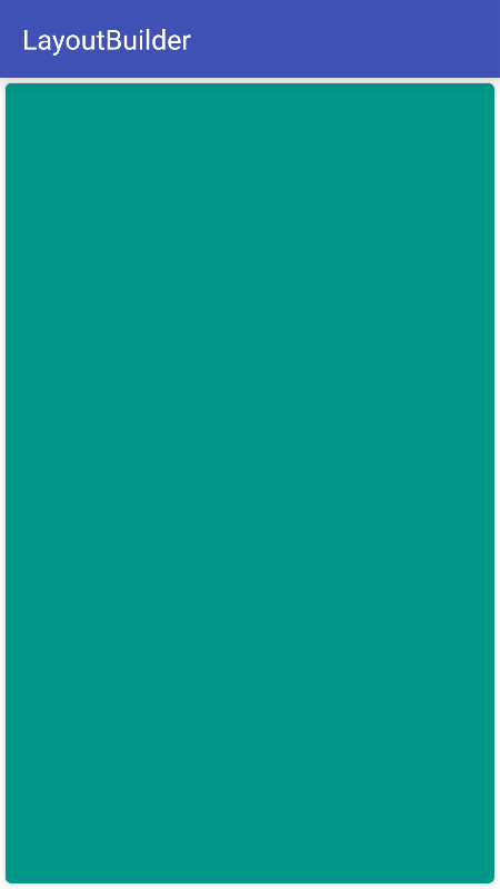
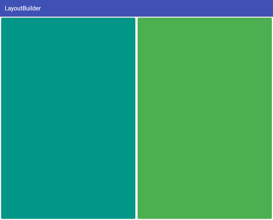
LayoutBuilder
If you want to layout your widgets based on the parent's size, this is the widget you need. One use-case for LayoutBuilder could be building different layouts for different screen sizes.
Widget build(BuildContext context) {
  return Scaffold(
    appBar: AppBar(title: const Text('LayoutBuilder')),
    body: LayoutBuilder(
      builder: (context, constraints) {
        if (constraints.maxWidth > 600) {
          return _buildWideContainers(constraints.maxWidth);
        } else {
          return _buildNormalContainer();
        }
      },
    ),
  );
}

Widget _buildNormalContainer() {
  return Center(
    child: Container(
      height: double.infinity,
      width: double.infinity,
      color: Colors.teal,
    ),
  );
}

Widget _buildWideContainers(double width) {
  return Center(
    child: Row(
      mainAxisAlignment: MainAxisAlignment.spaceEvenly,
      children: <Widget>[
        Container(
          height: double.infinity,
          width: width / 2,
          color: Colors.teal,
        ),
        Container(
          height: double.infinity,
          width: width / 2,
          color: Colors.green,
        ),
      ],
    ),
  );
}
Read more about LayoutBuilder here: here.
References
Official Flutter layout widgets page:
A great article on constraints in FLutter, a must-read:
To understand existing layouts & diagnose layout issues, use Flutter Inspector:
That's all for now. This blog is a work in progress. I'll try and add more Widgets and samples in the coming days. Feel free to drop a line if you don't understand something.
Thanks for reading!